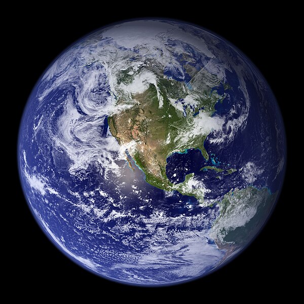
Blue is one of the three primary colours in the RYB colour model, as well as in the RGB (additive) colour model. It lies between violet and cyan on the spectrum of visible light. The term blue generally describes colours perceived by humans observing light with a dominant wavelength between approximately 450 and 495 nanometres. Most blues contain a slight mixture of other colours; azure contains some green, while ultramarine contains some violet. The clear daytime sky and the deep sea appear blue because of an optical effect known as Rayleigh scattering. An optical effect called the Tyndall effect explains blue eyes. Distant objects appear more blue because of another optical effect called aerial perspective.
Image: 2010. Донецк. Карнавал на день города 010
Image: Iranian Tiles 1
Image: Cyanerpes cyaneus Diergaarde Blijdorp, Netherlands 8a
Image: NASA Earth America 2002
A set of primary colors or primary colours consists of colorants or colored lights that can be mixed in varying amounts to produce a gamut of colors. This is the essential method used to create the perception of a broad range of colors in, e.g., electronic displays, color printing, and paintings. Perceptions associated with a given combination of primary colors can be predicted by an appropriate mixing model that reflects the physics of how light interacts with physical media, and ultimately the retina. The most common color mixing models are the additive primary colors and the subtractive primary colors.
A photograph of the red, green, and blue elements (subpixels) of an LCD. Additive mixing explains how light from these colored elements can be used for photorealistic color image reproduction.
Color Mixing Guide, John L. King 1925, cover and plates describing yellow, red, and blue color mixing.
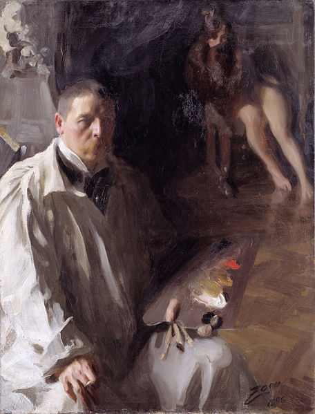
An 1896 self-portrait by Anders Zorn clearly showing a four-pigment palette of what are thought to be white, yellow ochre, vermillion, and black pigments.
Johann Heinrich Lambert's "Farbenpyramide" tetrahedron published in 1772. Gamboge (yellow), carmine (red), and Prussian blue pigments are used the corner swatches of each "level" of lightness with mixtures filling the others and white at the top.