Bodoni
Videos
Page
Bodoni is the name given to the serif typefaces first designed by Giambattista Bodoni (1740–1813) in the late eighteenth century and frequently revived since. Bodoni's typefaces are classified as Didone or modern. Bodoni followed the ideas of John Baskerville, as found in the printing type Baskerville—increased stroke contrast reflecting developing printing technology and a more vertical axis—but he took them to a more extreme conclusion. Bodoni had a long career and his designs changed and varied, ending with a typeface of a slightly condensed underlying structure with flat, unbracketed serifs, extreme contrast between thick and thin strokes, and an overall geometric construction.

The 1818 Manuale-Tipografico specimen manual of Bodoni's press, published after his death.
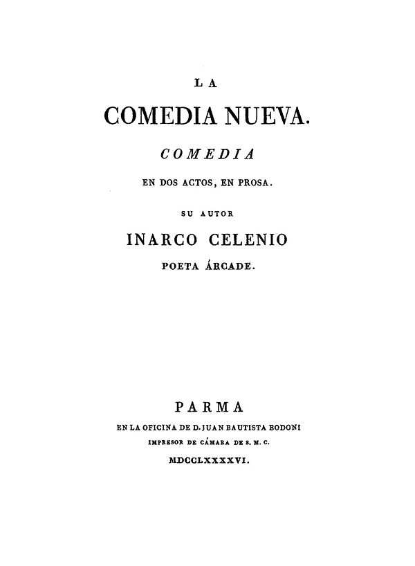
Comedia Nueva by Leandro Fernández de Moratín (published under the surename of Inarco Selenio). A title page printed by Bodoni, 1796

Proofs of page decorations from the Bodoni printing house

American Type Founder's Ultra Bodoni font in metal type. A derivative of their Bodoni family, the design is not directly based on Bodoni's own work but was very popular in advertising.
Typeface
Videos
Page
A typeface is a design of letters, numbers and other symbols, to be used in printing or for electronic display. Most typefaces include variations in size, weight, slope, width, and so on. Each of these variations of the typeface is a font.

A Specimen, a broadsheet with examples of typefaces and fonts available. Printed by William Caslon, letter founder; from the 1728 Cyclopædia.

London Underground's Johnston typeface, printed on a large sign
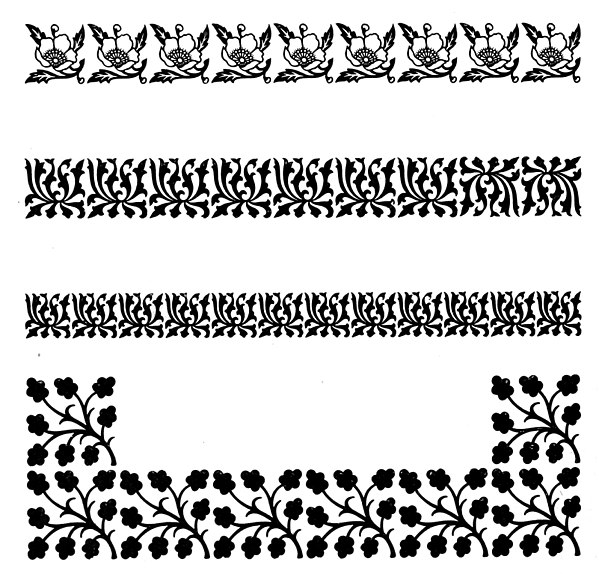
Specimens of printed floral borders from an 1897 type foundry specimen book.