Clarendon (typeface)
Videos
Page
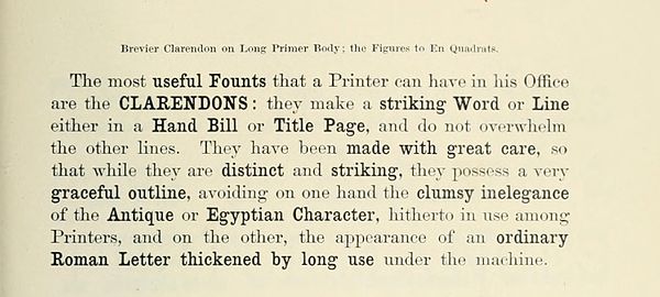
Clarendon is the name of a slab serif typeface that was released in 1845 by Thorowgood and Co. of London, a letter foundry often known as the Fann Street Foundry. The original Clarendon design is credited to Robert Besley, a partner in the foundry, and was originally engraved by punchcutter Benjamin Fox, who may also have contributed to its design. Many copies, adaptations and revivals have been released, becoming almost an entire genre of type design.
Clarendon in a Fann Street Foundry specimen book c. 1874, showing its use for emphasis within body text

Clarendon-style type on the body text of an 1890 poster
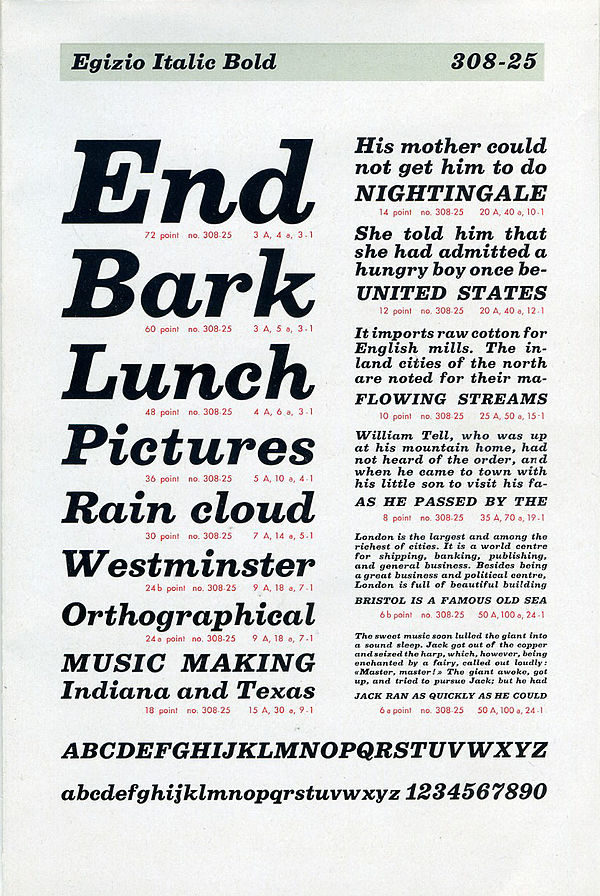
The italic of Egizio, intended to complement the pre-existing Clarendon design concept

French Clarendon wood type at the Hamilton Wood Type Museum, Wisconsin
Slab serif
Videos
Page
In typography, a slab serif typeface is a type of serif typeface characterized by thick, block-like serifs. Serif terminals may be either blunt and angular (Rockwell), or rounded (Courier). Slab serifs were introduced in the early nineteenth century.

Slab-serif type on the heading of a Chartist poster, 1848. Some headings and the lower passage are in Didone type, but much body text is slab serif.

Miller and Richard's Oldstyle Antique. Just as Clarendon typefaces took the "Didone" or modern-face model as a basis for a slab-serif, it is based on their "Old Style" design inspired by type designs of the eighteenth century, made slightly bolder and lower in contrast. Originally intended for use as a bolder type for emphasis, it was often used for general-purpose body text for example if legibility was considered important. Bookman is a derivative of this style.
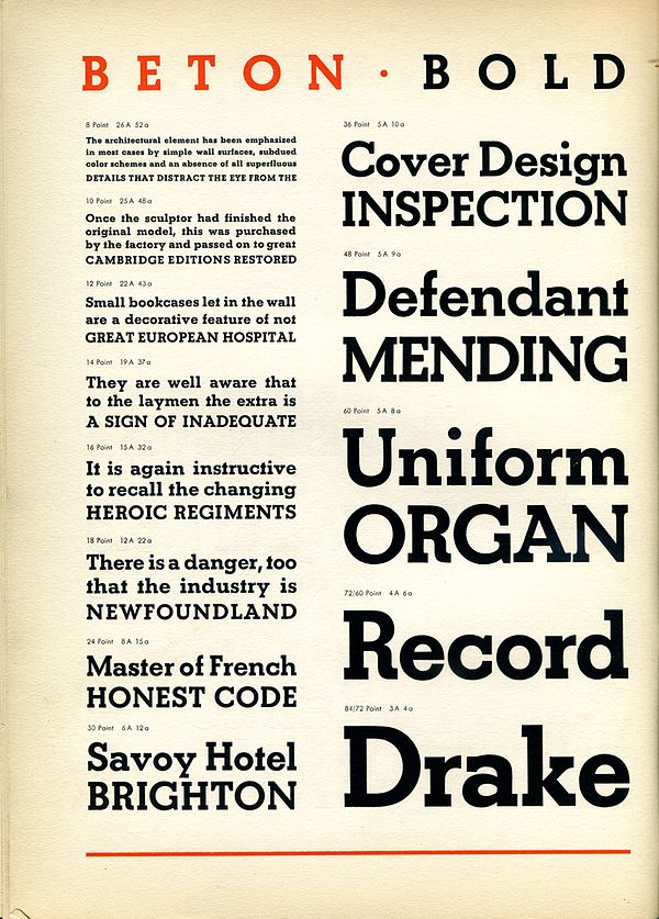
Beton Bold in a metal type sample. Contrast is minimal and letterforms take the circle as a basic shape.