Michael E. Mann
Videos
Michael Evan Mann is an American climatologist and geophysicist. He is a professor at the University of Pennsylvania, having stepped down from his administrative role as the director of the Center for
Mann in 2019


The Madhouse Effect How Climate Change Denial Is Threatening Our Planet Destroying Our Politics and Driving Us Crazy CSICon 2016
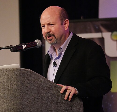
CSICon 2016

The original northern hemisphere hockey stick graph of Mann et al. 1999, smoothed curve shown in blue with its uncertainty range in light blue, overlaid with green dots showing the 30-year global average of the PAGES 2k Consortium 2013 reconstruction. The red curve shows measured global mean temperature, according to HadCRUT4 data from 1850 to 2013.
Hockey stick graphs present global or hemispherical mean global surface temperatures of the distant past, as shown by quantitative climate reconstructions based on climate proxy records, in relation t
Michael E. Mann
…the past 600 years. In 1999 the same team used these techniques to produce a reconstruction over the past 1,000 years (MBH99), which was dubbed the "hockey stick graph" because of its shape. He was one of eight lead authors of the "Observed Climate Variability and Change" chapter of the Intergovernmental Panel on…
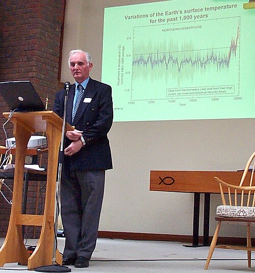
IPCC WG1 Co-chair Sir John T. Houghton showing the IPCC fig. 2.20 hockey stick graph at a climate conference in 2005