Old Style (Miller & Richard)
Videos
Old Style, later referred to as modernised old style, is a series of serif typefaces cut from the mid-nineteenth century and sold by the type foundry Miller & Richard, of Edinburgh in Scotland. It was
Miller & Richard's original specimen for their Old Style fonts, in a mock-traditional style with the long s and archaic ligatures.


Old Style in a Miller & Richard specimen, showing its quite wide, light structure.

Old Style Italic in a Miller & Richard specimen. The italic has a strong slant.
Caslon
Videos
Caslon is the name given to serif typefaces designed by William Caslon I in London, or inspired by his work.
Old Style (Miller & Richard)
…faces of Miller & Richard, reportedly cut by punchcutter Alexander Phemister, were made in imitation of earlier styles of typeface, particularly the Caslon typeface cut by William Caslon from the 1720s, but with a modernised design. It was immediately very successful: the 1880s Bibliography of Printing…

William Caslon in an engraved portrait by John Faber the younger
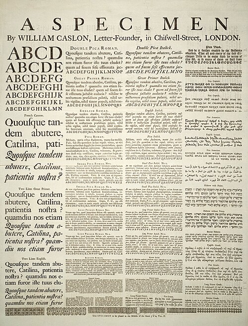
William Caslon's specimen sheet (dated 1734 but actually issued from 1738 onwards). Some of the types shown were not cut by Caslon, most notably the French Canon roman (probably cut by Joseph Moxon).

The Fry type foundry's imitations of first Baskerville (above) and then Caslon type (below), shown in a specimen attached to an edition of The Printer's Grammar, 1787. Mosley describes them as "a very close copy that is not easy to tell from the original."
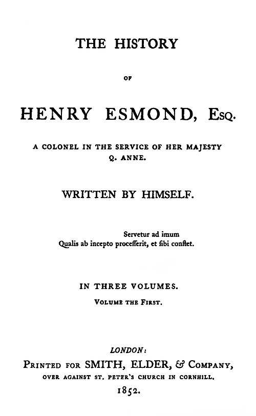
The History of Henry Esmond, a novel by Thackeray written as a fictional memoir. The first edition, of 1852, was printed in Caslon type, then just coming back into fashion. The goal was to achieve a period feel appropriate to its early eighteenth-century setting.