Akzidenz-Grotesk
Videos
Akzidenz-Grotesk is a sans-serif typeface family originally released by the Berthold Type Foundry of Berlin. "Akzidenz" indicates its intended use as a typeface for commercial print runs such as publicity, tickets and forms, as opposed to fine printing, and "grotesque" was a standard name for sans-serif typefaces at the time.

Akzidenz-Grotesk seems to be a derivative of this shadowed sans-serif (Schattierte Grotesk, detail below) released by the Bauer & Co. foundry of Stuttgart in 1896, the year before it was taken over by Berthold.

A 1905 advertisement for Berthold in a Swedish printing journal, offering Royal-Grotesk, later branded as the light weight of Akzidenz-Grotesk, for sale. The sans-serif type is used in a secondary role underneath a more decorative heading face.

Font designer Dan Reynolds (above) and graphic design professor Indra Kupferschmid (below) have documented many aspects of the early history of Akzidenz-Grotesk.
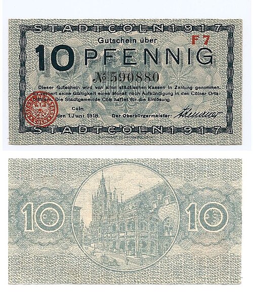
A German banknote from 1918, using a range of sans-serifs of the period
Haas Type Foundry
Videos
Haas Type Foundry was a Swiss manufacturer of foundry type. First the factory was located in Basel, in the 1920s they relocated to Münchenstein.

Haas Type Foundry buildings in Münchenstein, Switzerland