Didone is a genre of serif typeface that emerged in the late 18th century and was the standard style of general-purpose printing during the 19th century. It is characterized by:Narrow and unbracketed (hairline) serifs.
Vertical orientation of weight axes.
Strong contrast between thick and thin lines.
Some stroke endings show ball terminals.
An unornamented, "modern" appearance.
Didot's type in the Code civil des Français, printed by the company of Firmin Didot in 1804.
Two pages from Bodoni's Manuale Tipografico, a posthumous showcase of his work and engraving by his wife.
The 1861 title page of Great Expectations in the sharp, high-contrast Didone type of the period. Popular at the time, the style had disappeared almost completely by the middle of the twentieth century.
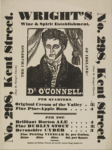
Fat face type on a poster. London, c. 1840s
A typeface is a design of letters, numbers and other symbols, to be used in printing or for electronic display. Most typefaces include variations in size, weight, slope, width, and so on. Each of these variations of the typeface is a font.
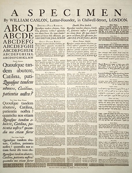
A Specimen, a broadsheet with examples of typefaces and fonts available. Printed by William Caslon, letter founder; from the 1728 Cyclopædia.
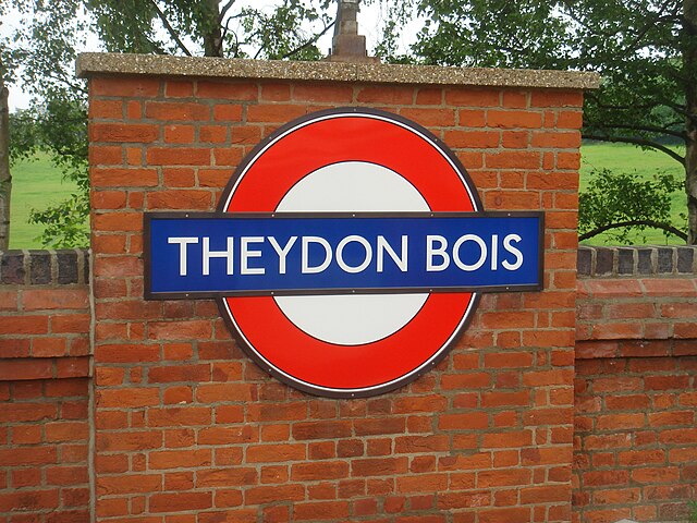
London Underground's Johnston typeface, printed on a large sign
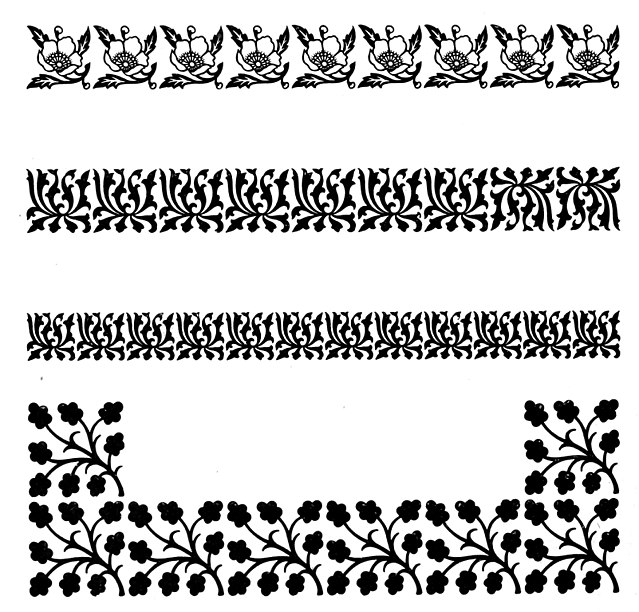
Specimens of printed floral borders from an 1897 type foundry specimen book.