Gill Sans
Videos
Page
Gill Sans is a humanist sans-serif typeface designed by Eric Gill and released by the British branch of Monotype from 1928 onwards.

A drawing and photographed carving by Gill of the "Trajan" capitals on Trajan's Column in Rome, a model for the capitals of Gill Sans and Johnson. Respected by Arts and Crafts artisans as among the best ever drawn, many signs and lettering projects created with an intentionally artistic design are based on them.

An early version of Johnston on a London Underground metal sign. Johnston's design was rendered variably on some older signs, and this uses a condensed "R" and four-terminal "W".

The gloomy, ultra-bold sans-serifs of the Figgins foundry. Gill and Johnston sought to create sans-serif designs that were modern and not as bold as these. Gill argued in his Essay on Typography that such closed-up forms were counterproductively bold, less legible than lighter fonts of normal proportions.

Some of Gill's original art for Gill Sans, showing the original "Q", punctuation and two manicules
Sans-serif
Videos
Page
In typography and lettering, a sans-serif, sans serif, gothic, or simply sans letterform is one that does not have extending features called "serifs" at the end of strokes. Sans-serif typefaces tend to have less stroke width variation than serif typefaces. They are often used to convey simplicity and modernity or minimalism. For the purposes of type classification, sans-serif designs are usually divided into these major groups: § Grotesque and § Neo-grotesque, § Geometric, § Humanist and § Other or mixed.

Rothbury, an early modulated sans-serif typeface from 1915. The strokes vary in width considerably.

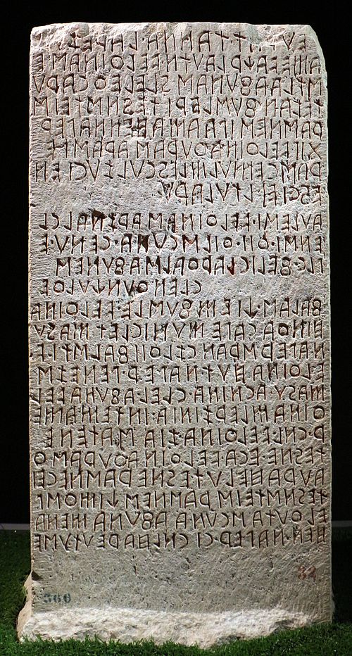
Sans-serif letterforms in ancient Etruscan on the Cippus Perusinus

Roman square capitals, the inspiration for serif letters

A 12th-century Medieval Latin inscription in Italy featuring sans-serif capitals