Metro is a sans-serif typeface family created by William Addison Dwiggins and released by the American Mergenthaler Linotype Company from 1929 onwards.
Metrolite and Metroblack No. 2 fonts shown in a Linotype specimen. Both runs of text are cast from the same duplexed matrices which could cast either weight, so the width is identical; the light weight tends to look wider because of the lower stroke width.
In typography and lettering, a sans-serif, sans serif, gothic, or simply sans letterform is one that does not have extending features called "serifs" at the end of strokes. Sans-serif typefaces tend to have less stroke width variation than serif typefaces. They are often used to convey simplicity and modernity or minimalism. For the purposes of type classification, sans-serif designs are usually divided into these major groups: § Grotesque and § Neo-grotesque, § Geometric, § Humanist and § Other or mixed.
Rothbury, an early modulated sans-serif typeface from 1915. The strokes vary in width considerably.
Sans-serif letterforms in ancient Etruscan on the Cippus Perusinus
Roman square capitals, the inspiration for serif letters
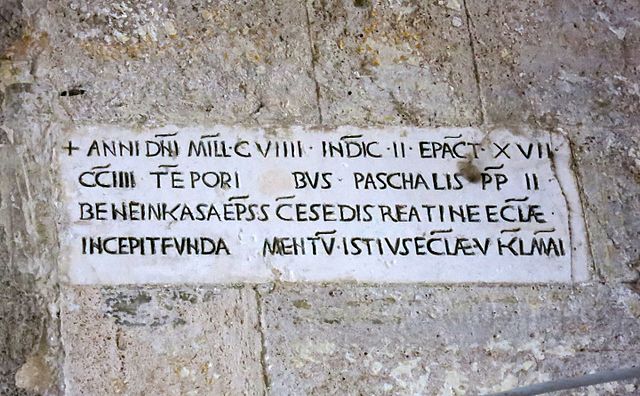
A 12th-century Medieval Latin inscription in Italy featuring sans-serif capitals