Optima
Videos
Photos
Optima is a humanist sans-serif typeface designed by Hermann Zapf and released by the D. Stempel AG foundry, Frankfurt, West Germany in 1958.

Zapf cited this gravestone as inspiring Optima. Portions of the text are copied onto one of his 1950 sketches.
Sans-serif
Videos
Photos
In typography and lettering, a sans-serif, sans serif, gothic, or simply sans letterform is one that does not have extending features called "serifs" at the end of strokes. Sans-serif typefaces tend to have less stroke width variation than serif typefaces. They are often used to convey simplicity and modernity or minimalism. For the purposes of type classification, sans-serif designs are usually divided into these major groups: § Grotesque and § Neo-grotesque, § Geometric, § Humanist and § Other or mixed.

Rothbury, an early modulated sans-serif typeface from 1915. The strokes vary in width considerably.
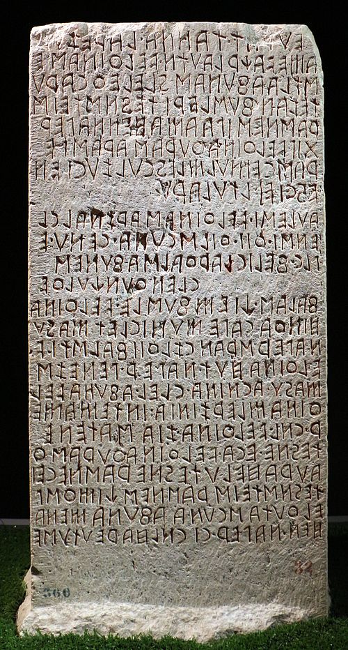
Sans-serif letterforms in ancient Etruscan on the Cippus Perusinus

Roman square capitals, the inspiration for serif letters

A 12th-century Medieval Latin inscription in Italy featuring sans-serif capitals