Roboto
Videos
Roboto is a neo-grotesque sans-serif typeface family developed by Google as the system font for its mobile operating system Android, and released in 2011 for Android 4.0 "Ice Cream Sandwich".

Slab serif
Videos
In typography, a slab serif typeface is a type of serif typeface characterized by thick, block-like serifs. Serif terminals may be either blunt and angular (Rockwell), or rounded (Courier). Slab serifs were introduced in the early nineteenth century.
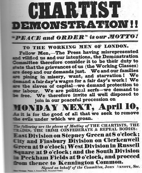
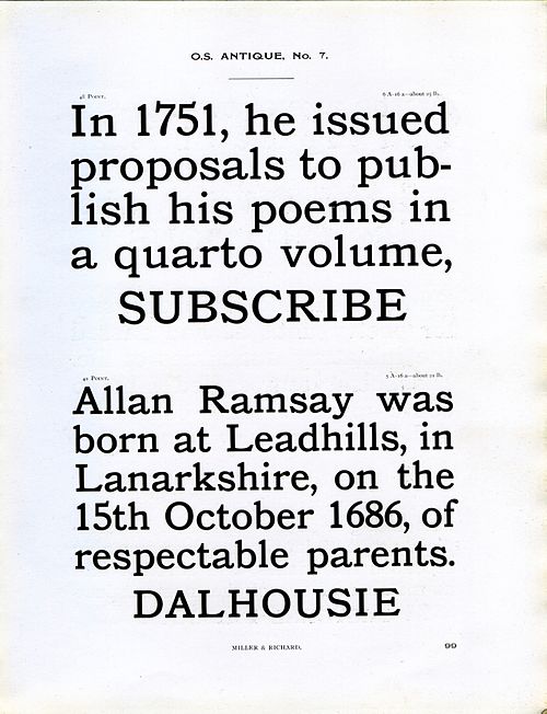
Miller and Richard's Oldstyle Antique. Just as Clarendon typefaces took the "Didone" or modern-face model as a basis for a slab-serif, it is based on their "Old Style" design inspired by type designs of the eighteenth century, made slightly bolder and lower in contrast. Originally intended for use as a bolder type for emphasis, it was often used for general-purpose body text for example if legibility was considered important. Bookman is a derivative of this style.
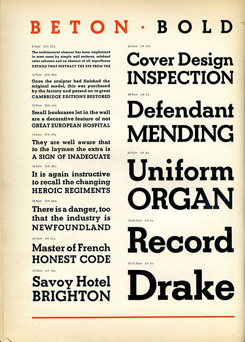
Beton Bold in a metal type sample. Contrast is minimal and letterforms take the circle as a basic shape.