Transport is a sans serif typeface first designed for road signs in the United Kingdom. It was created between 1957 and 1963 by Jock Kinneir and Margaret Calvert as part of their work as designers for the Department of Transport's Anderson and Worboys committees.
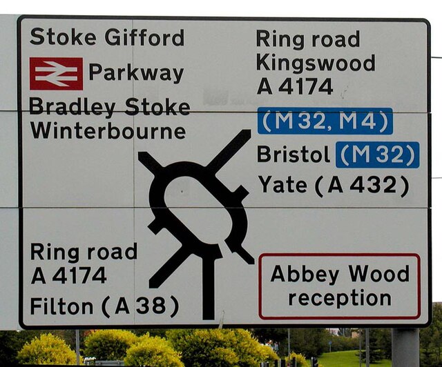
A road sign written mainly in Transport Heavy; the white on blue text is Transport Medium.
A Scottish sign using the typeface on the Isle of Skye, with place names given in both Scots Gaelic and English, and distances shown in miles.
Example of the use of the typeface in road signs in Portugal
Irish road signs using dotless i and single-storey (script) a (upper and lower case)
In typography and lettering, a sans-serif, sans serif, gothic, or simply sans letterform is one that does not have extending features called "serifs" at the end of strokes. Sans-serif typefaces tend to have less stroke width variation than serif typefaces. They are often used to convey simplicity and modernity or minimalism. For the purposes of type classification, sans-serif designs are usually divided into these major groups: § Grotesque and § Neo-grotesque, § Geometric, § Humanist and § Other or mixed.
Rothbury, an early modulated sans-serif typeface from 1915. The strokes vary in width considerably.
Sans-serif letterforms in ancient Etruscan on the Cippus Perusinus
Roman square capitals, the inspiration for serif letters
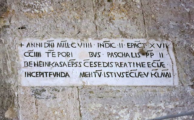
A 12th-century Medieval Latin inscription in Italy featuring sans-serif capitals